Fruitmarket Gallery
Market Street, Edinburgh
“This project has opportunities for artists and audiences at its heart. It delivers an inspirational new space for creative, collaborative working and renovates the Fruitmarket’s existing spaces, ensuring that we can continue to operate at the forefront of contemporary culture for decades to come” - Fiona Bradley, Director of the Fruitmarket Gallery
"We are delighted that the refurbishment and expansion of the Fruitmarket, begun in 2011 when the building was first identified by the Board as the key risk facing the organisation, is complete, and our well-loved but well-worn building is now reinvented as a bold, new, collaborative cultural space.
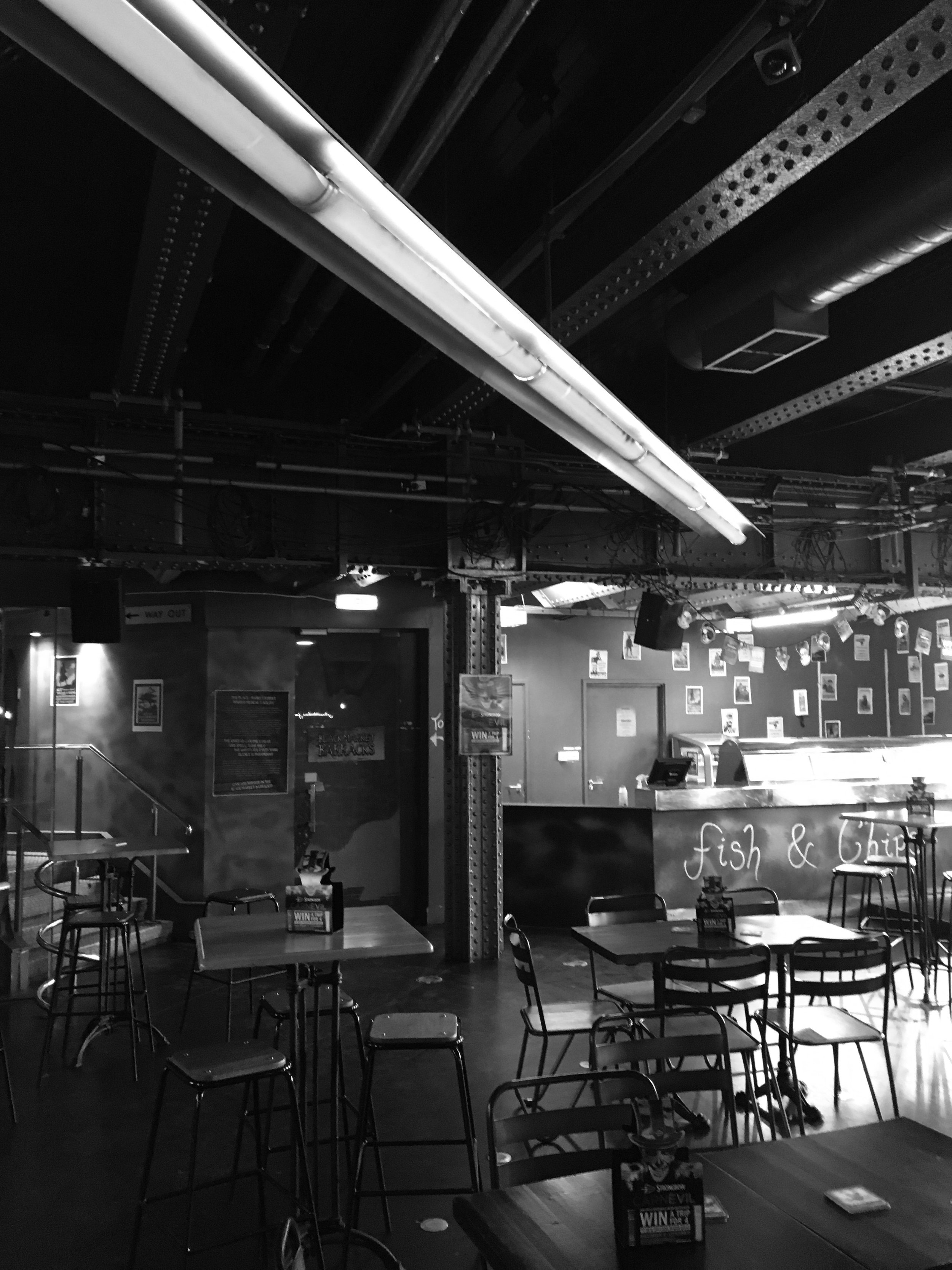
It’s been quite a journey, with slips, trips, and accidents both happy and unhappy along the way. Our first plan was to build a second storey onto our fruit and vegetable warehouse originally built for Rankin’s Fruit Markets Ltd in 1931 and converted into a space for art when the markets moved out of town in 1972. Then we thought we could move sideways, first into the slot between our building and the neighbouring one, built in 1889 for fruiterers James Lindsay & Son, and occupied by nightclubs (first Buster Browns then Electric Circus) since the 1970s. Then the proprietor of Electric Circus retired, offering us his lease, and Gareth Hoskins Architects designed an ambitious new art gallery uniting the two buildings. A funding blow meant that we were not able to secure the money necessary to complete that plan, and in 2017 we started again.
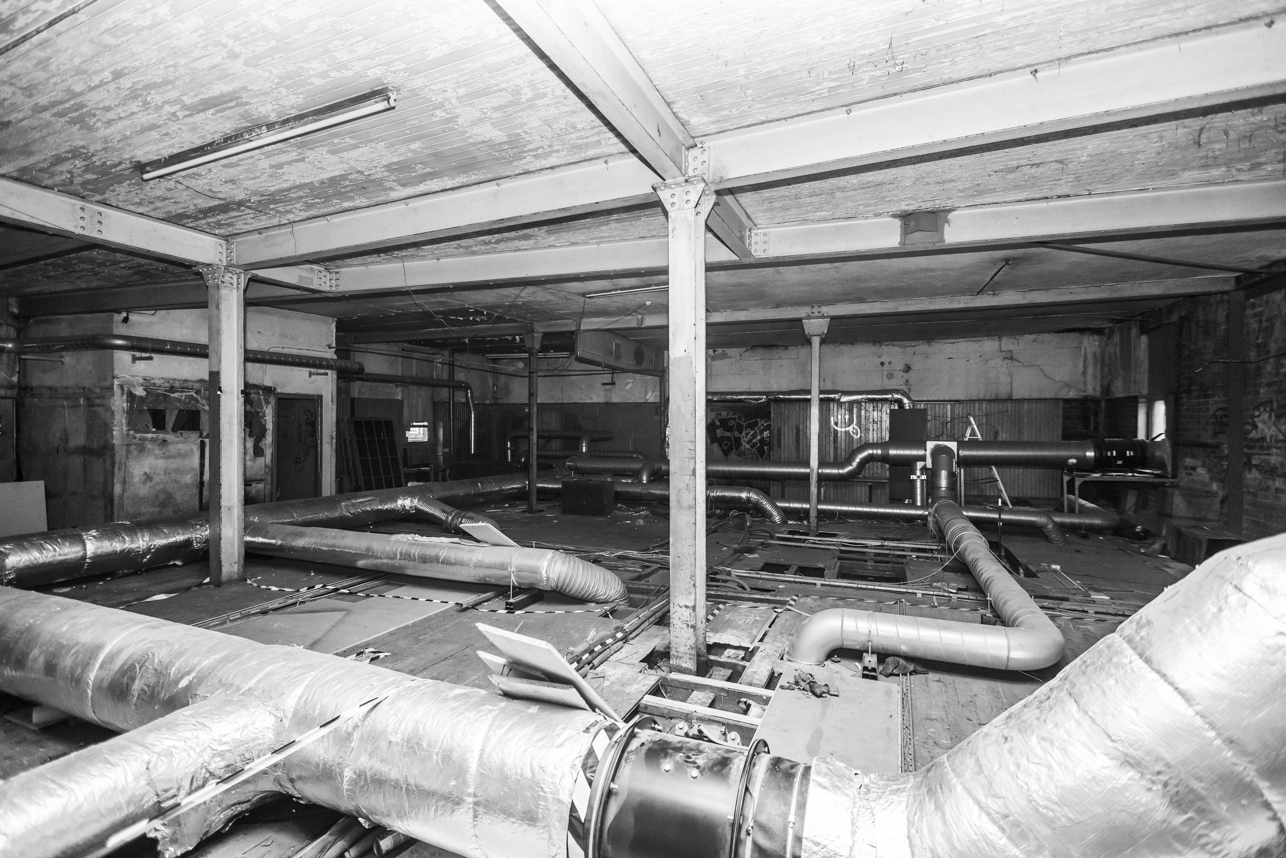
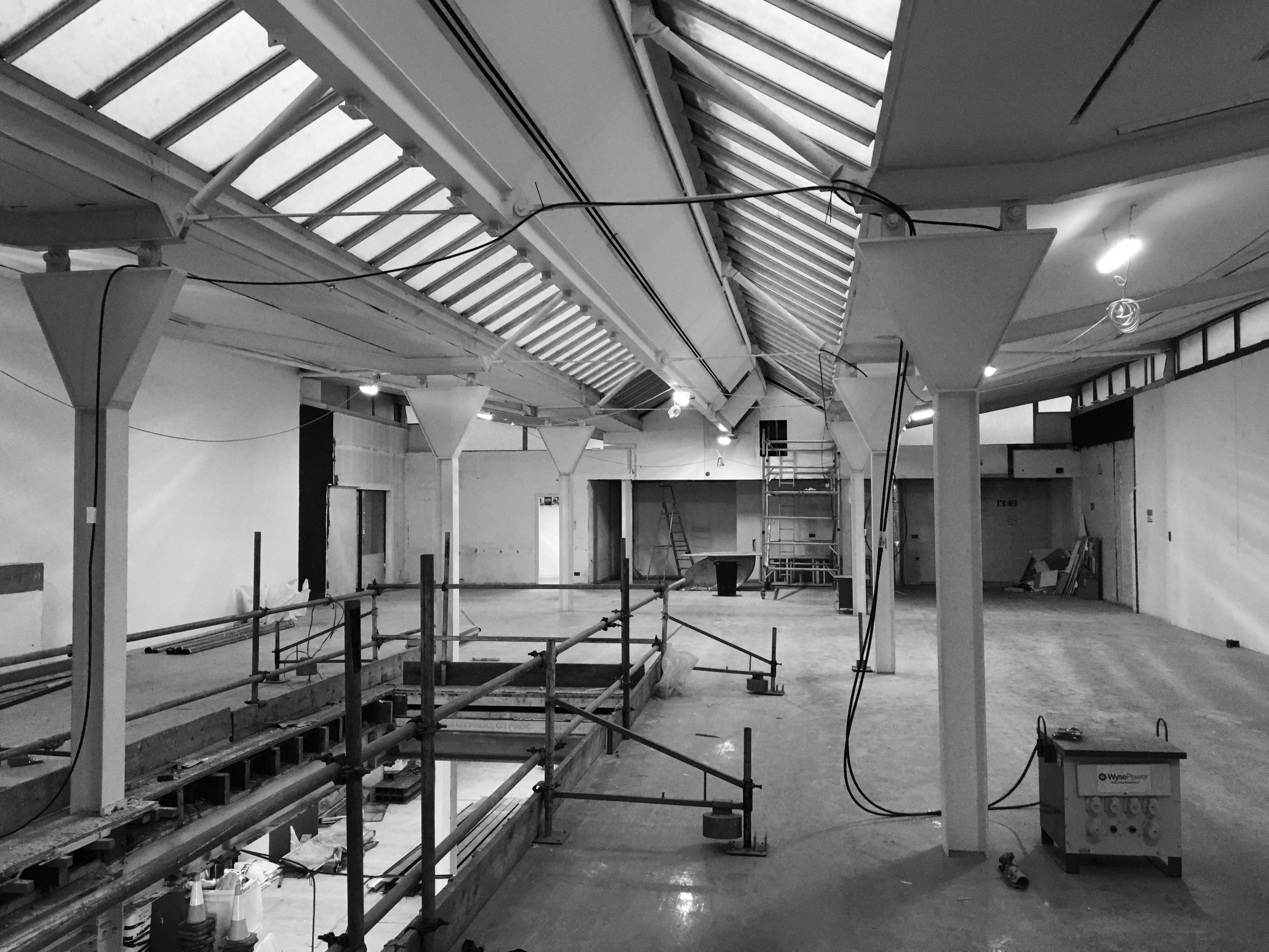
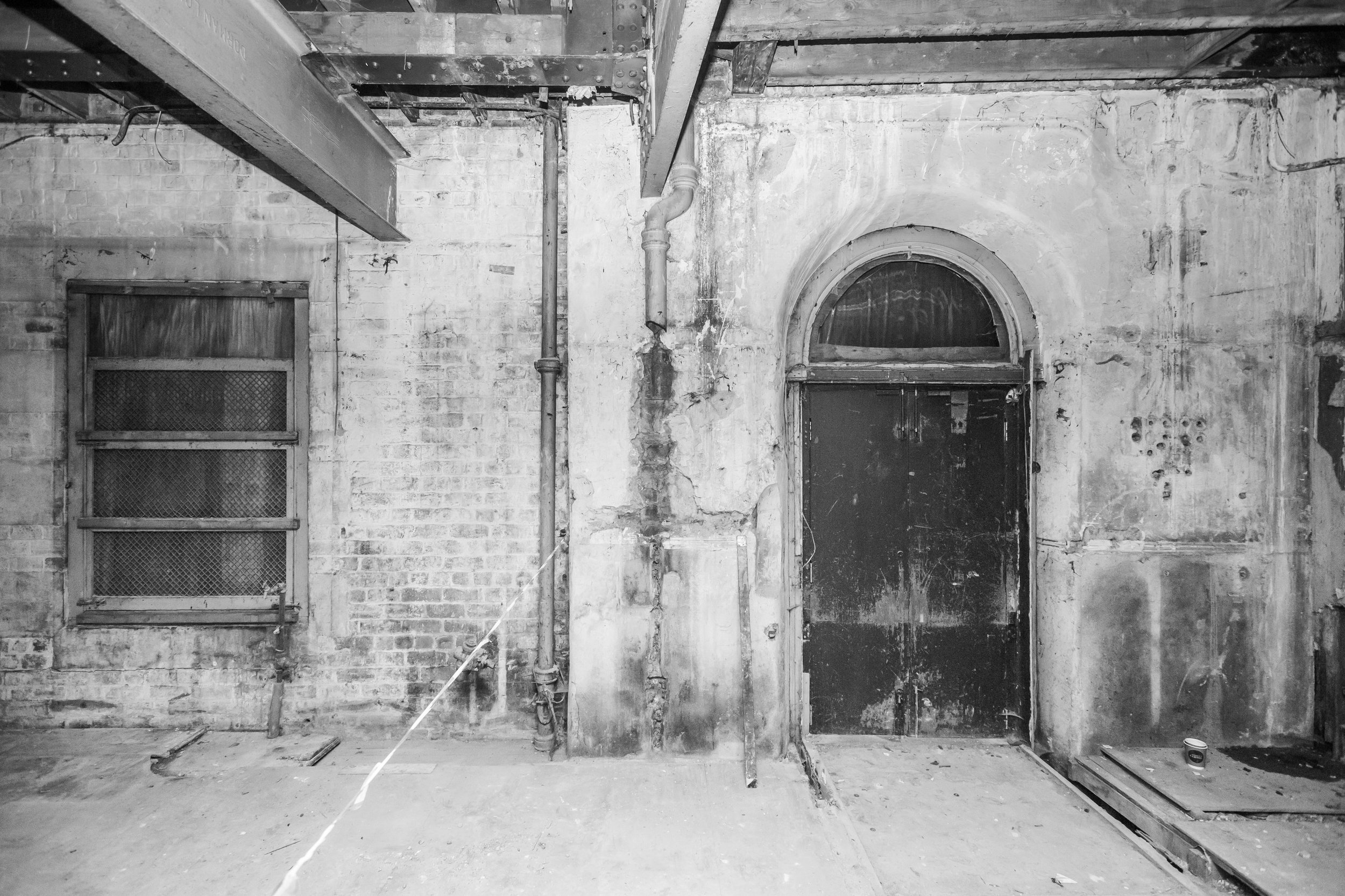
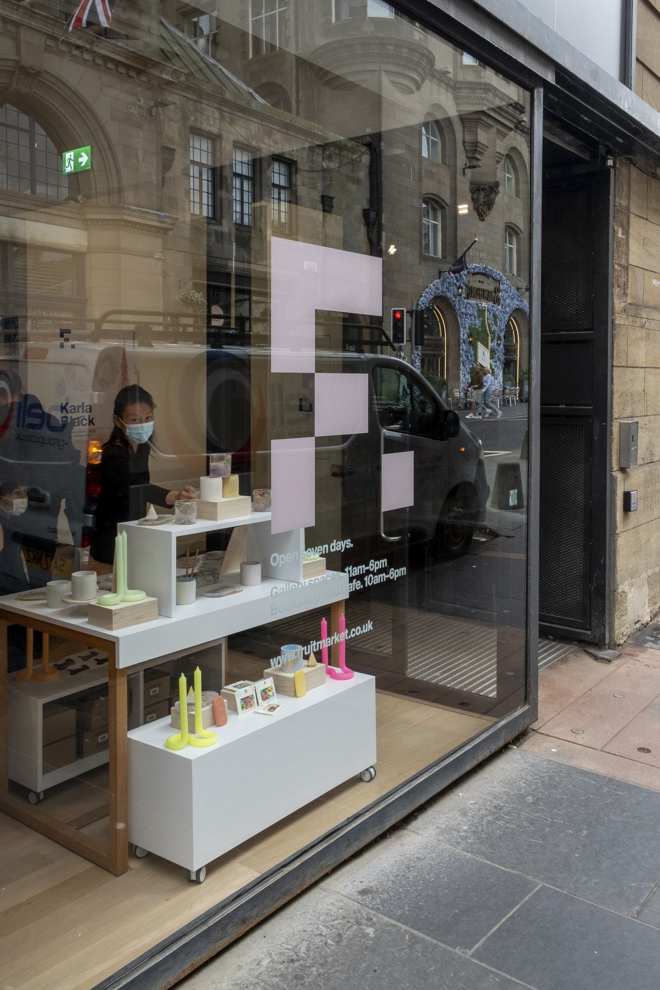
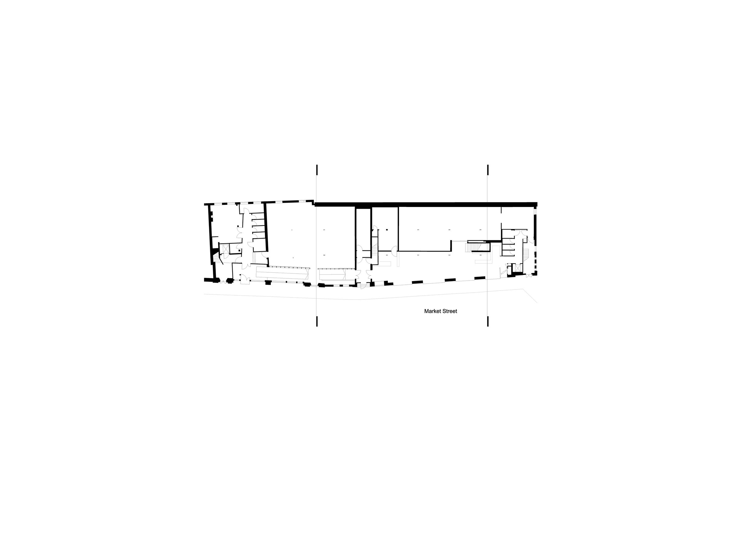
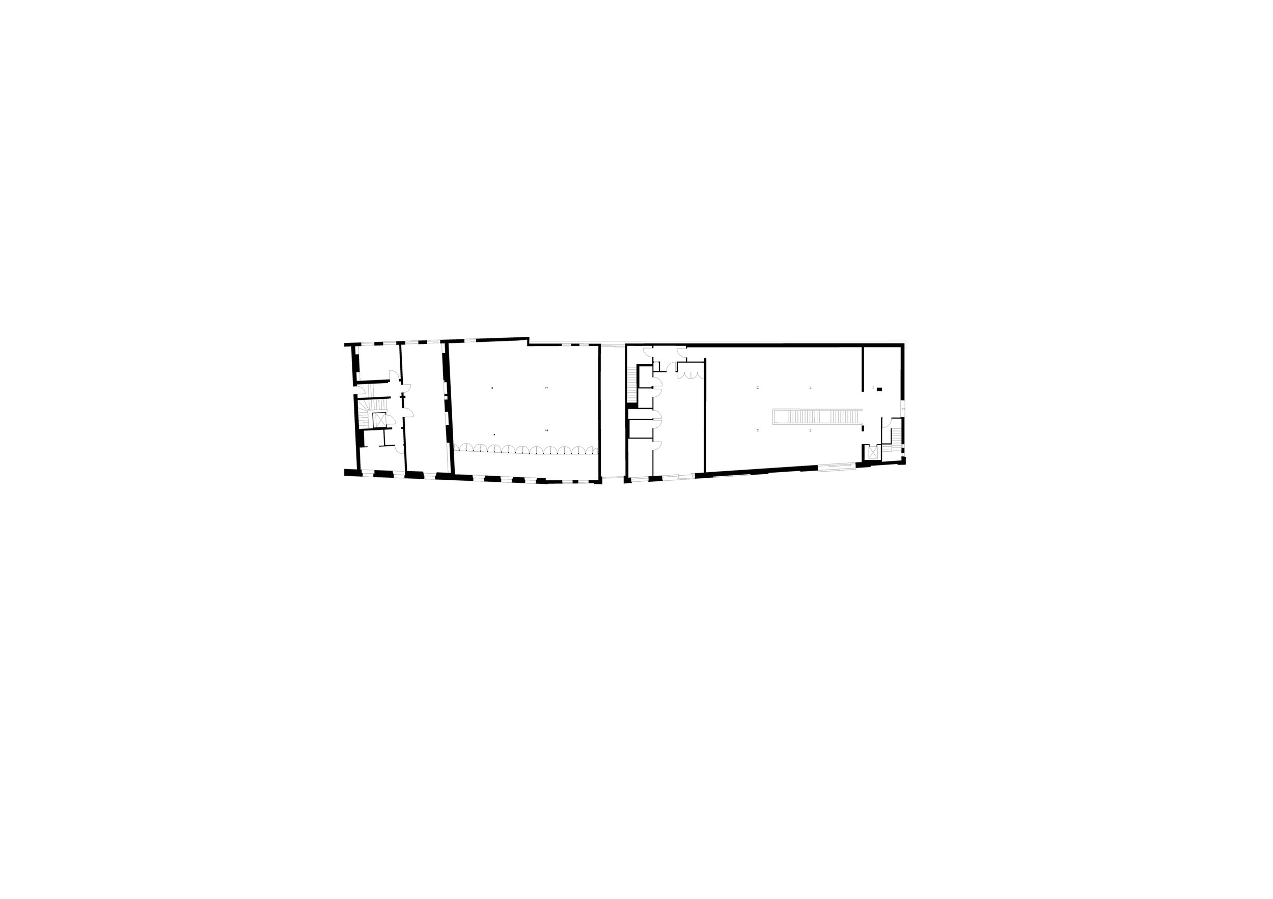
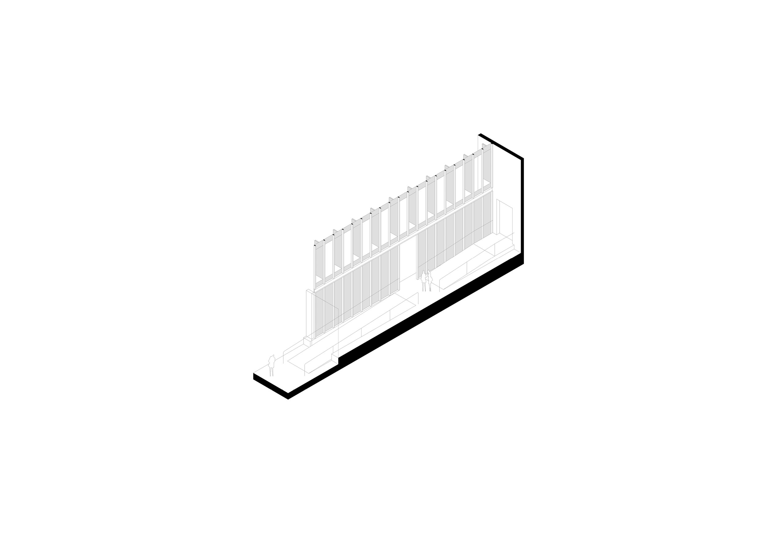
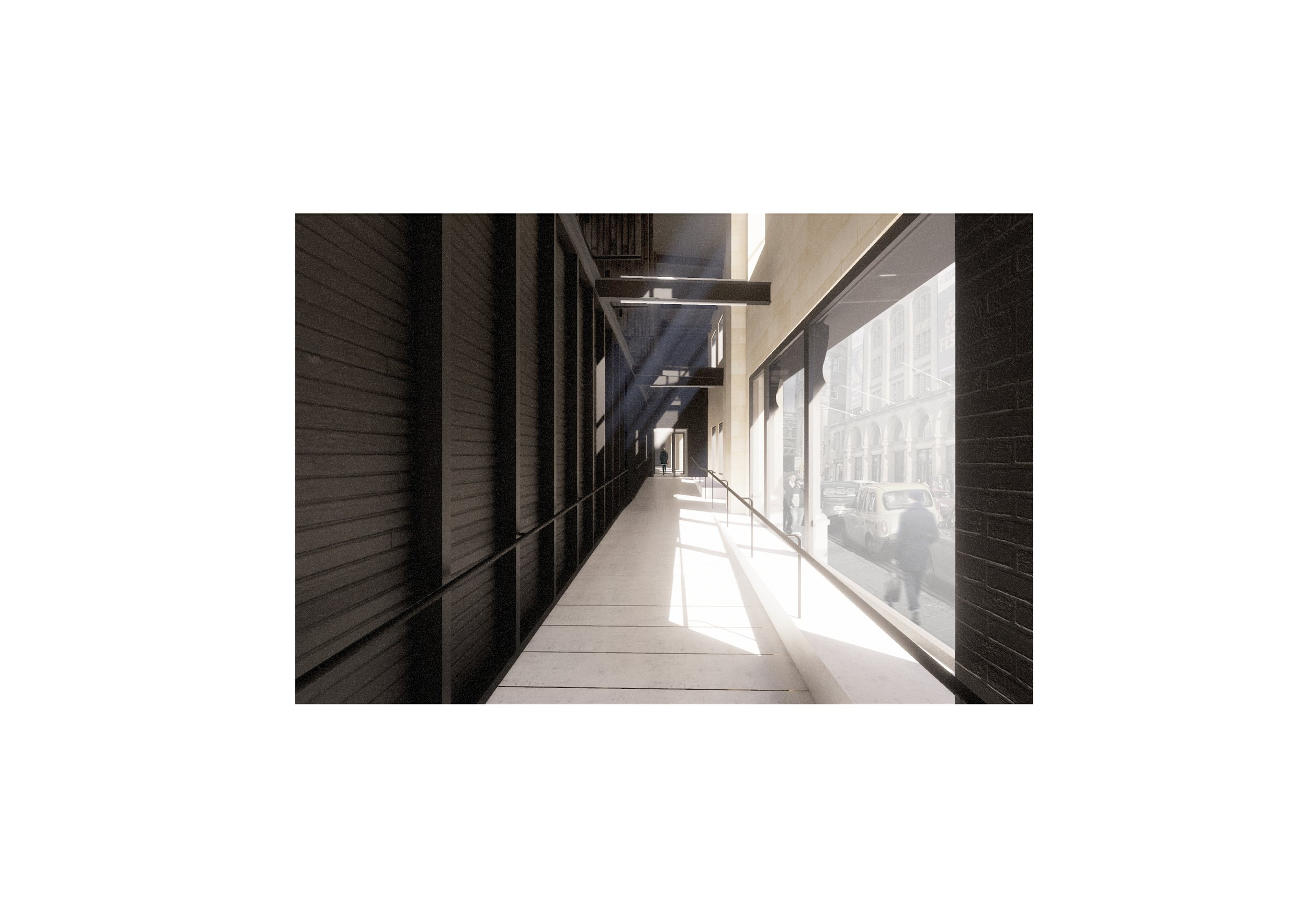
Together with Neil Gillespie of Reiach & Hall Architects we imagined an approach to the original Fruitmarket building that simplifies the spaces and improves the material finishes of the exhibition galleries; removes barriers to access with more toilets and a new lift, staircase and entrance; and makes room for the first dedicated learning studio we have ever had. At the same time, we opened up the next-door building, keeping it as raw as possible to allow the material resonance of its steel and brick structure to speak for itself and inspire artists. Removing the partition between floors allowed us to reveal the height of the space and some of its historic, industrial details like the massive steel truss that supports it, while new features like the window shutters and the wall that separates the new warehouse gallery from the street were made from the timbers and joists of the old floor.
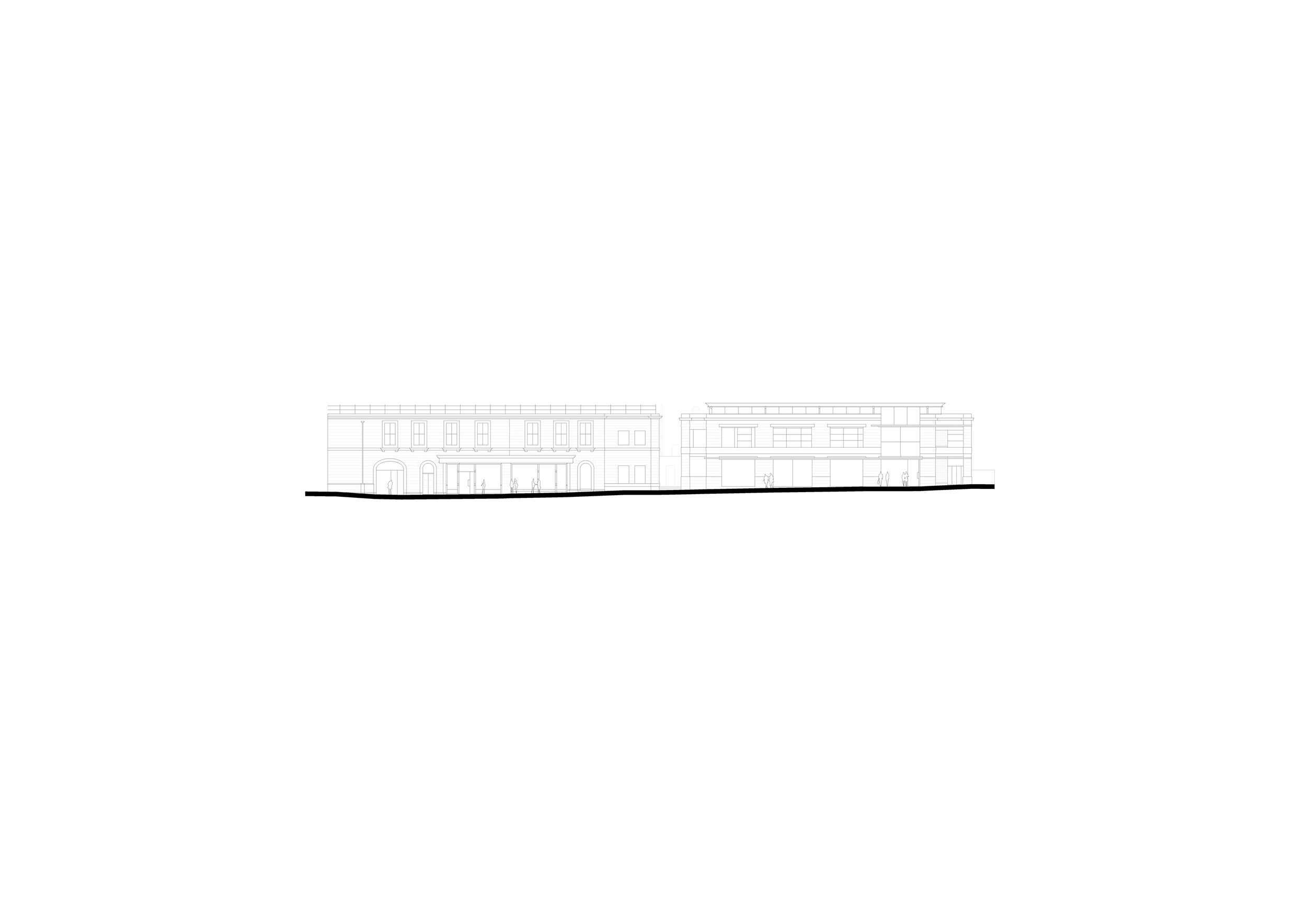
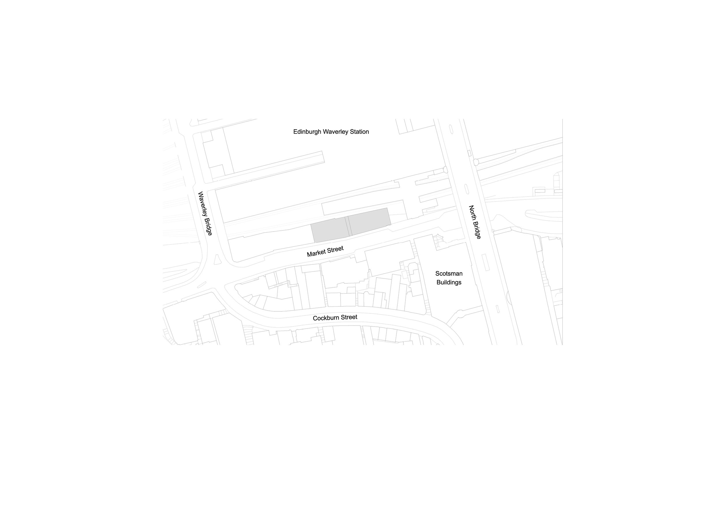
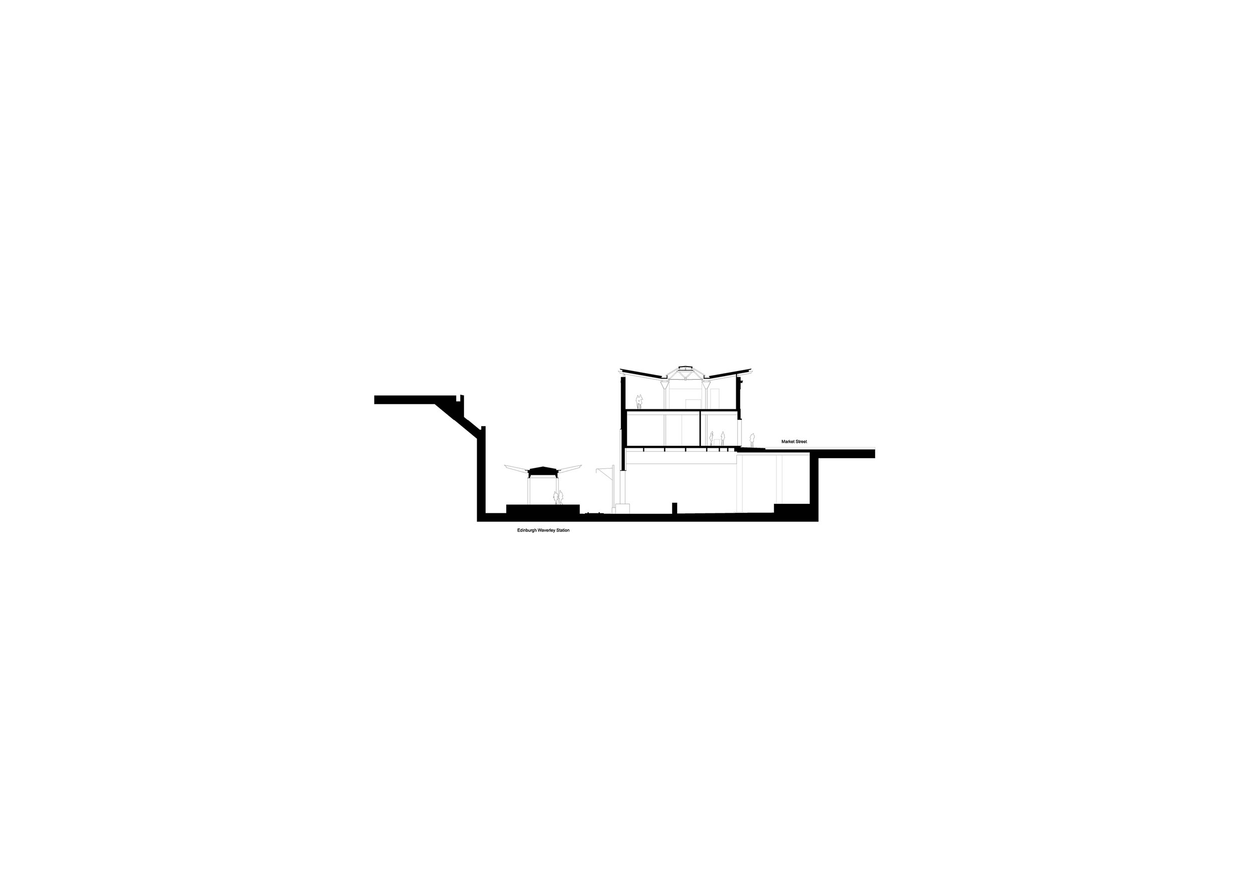
"Every building project has challenges, and ours has had more than some. The Fruitmarket buildings have no foundations, but hover over the train tracks of Waverley Station. Market Street itself is a bridge rather than a road. The buildings were built incrementally over 42 years and are on several different levels, meeting the pavement only at either end of the new Fruitmarket’s long façade. The team at Reiach & Hall have come up with some ingenious solutions, not least the ramp that mirrors the pavement and helps the visitor negotiate those several levels.
We were intending to open to the public on 31 July 2020. The Covid-19 pandemic put paid to that, and we opened instead on 7 July 2021, a decade after we first started trying to improve the Fruitmarket. We are proud of what we have built, and we are proud to be a public space, here for the people of and visitors to Edinburgh. We love how visitors are already beginning to feel at home in the building, and reinventing and reimagining it as they move around it." - Fiona Bradley, Director, The Fruitmarket Gallery
A Mirroring of Ideas and Intentions
The Fruitmarket Gallery plays a vital role in the shaping and propagation of contemporary arts culture in Scotland. In our straightened times arts organisations like the Fruitmarket, although of national importance, operate on the margins of financial viability. To survive they must be resilient, inventive, and agile, relying heavily on the intelligence, energy and guile of their staff and board. Accessibility and inclusivity are central to the Fruitmarket’s developing remit and ambitions.
These characteristics and intentions are mirrored in the ambitions of the architectural project. Arts buildings must be flexible and open. They must support the organization in its aims. They must be capable of being re-imagined, maintaining their usefulness and relevance.
The Architectural Project
A 1930’s market building, adjacent to Waverley Station in central Edinburgh, was converted to an art gallery by John L Patterson in the 1970’s, then radically restructured by Richard Murphy Architects in the early 1990’s. By 2013 the gallery’s ideas and direction, along with the funding landscape, had changed resulting in plans for a major reconstruction project. The funding for a comprehensive redevelopment however was unsuccessful. Rebounding from this setback the client group reassessed their approach. A further competition was organised in 2018. The essence of the brief was to retain, refurbish and recalibrate the original gallery while extending into the adjacent warehouse.
The underlying theme of our submission was “let’s work with what we have”. The existing buildings have been heavily altered, each bear evidence of their earlier uses, let’s celebrate those histories. We directly addressed the pragmatic issues with the existing galleries and in an almost archaeological approach simply unearthed the basic volume of the new warehouse. The completed and connected building complex is a rich palimpsest of the traces of previous lives while anticipating future lives.
The two main components of the brief, renovation, and extension are contained within and expressed through two contrasting and complimentary archetypal spaces.
The Original Galleries
The renovation, recalibration and reconfiguration of the existing building ensures that it is fully accessible and fit for the showing of contemporary visual art. We were sensitive to the building’s qualities and its spatial characteristics, traditional ‘’white’’ gallery spaces that are light filled and rationally structured. The top-lit galleries particularly convey a sense of the solitary, a place for the individual to quietly engage with art. We sought to heighten the sense of balance and symmetry through a simplification of some of the existing gallery elements. The work to the existing galleries included the replacement of roof glazing, renewal and alterations to wall finishes, new services installations, new lift and a redesign of the main stair into a safer, quieter, more grounded element. The overall design intention was to amplify the existing sense of light and space in order that the art remains centre stage.
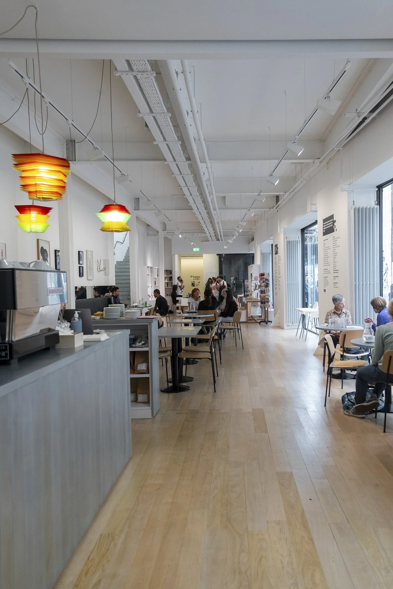
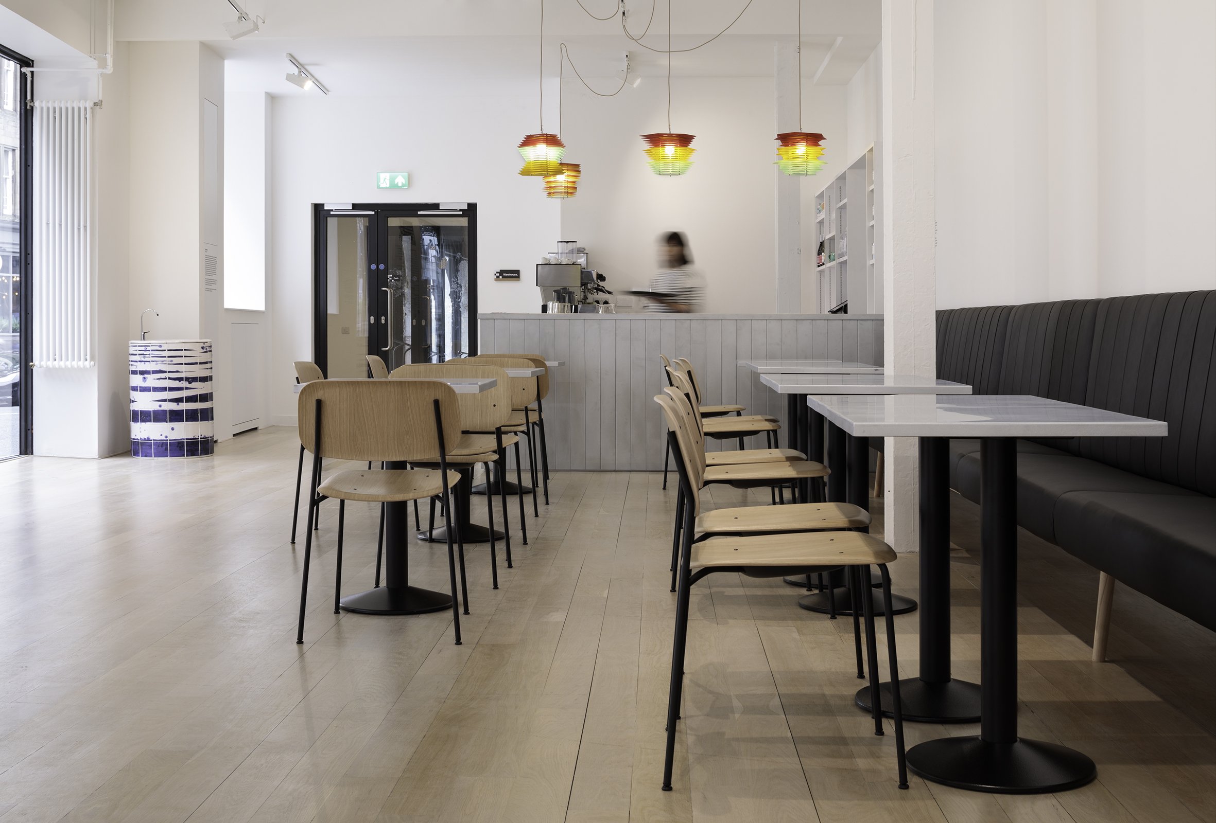
Critical to concerns of financial viability, the reconfiguration also increased the café and shop spaces along with new and expanded kitchen and improved accessible toilet facilities. Critical to the gallery’s outreach and inclusivity ambitions, the project also created a dedicated education suite. Collectively these amendments dramatically improve the gallery’s ability to host performances, conferences and events.
The Warehouse
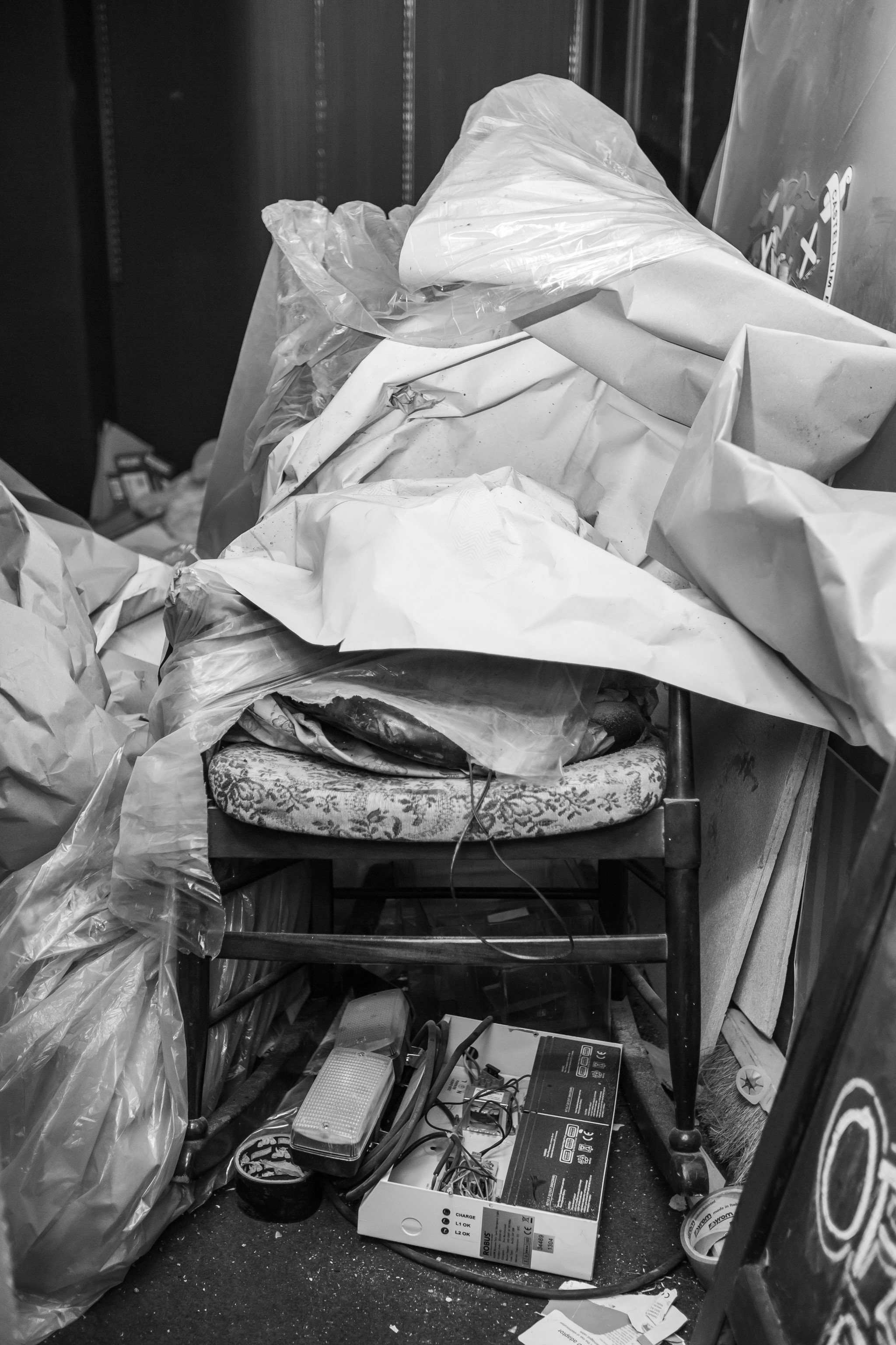
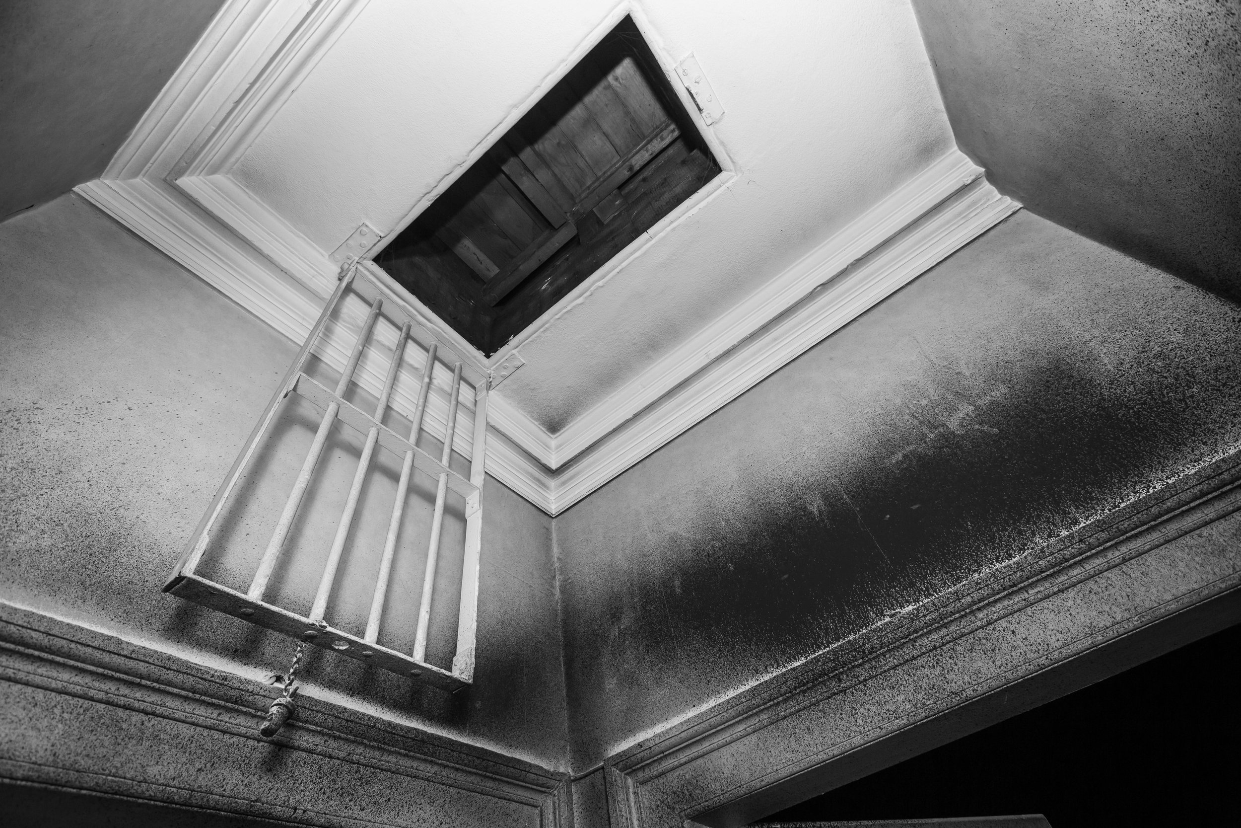
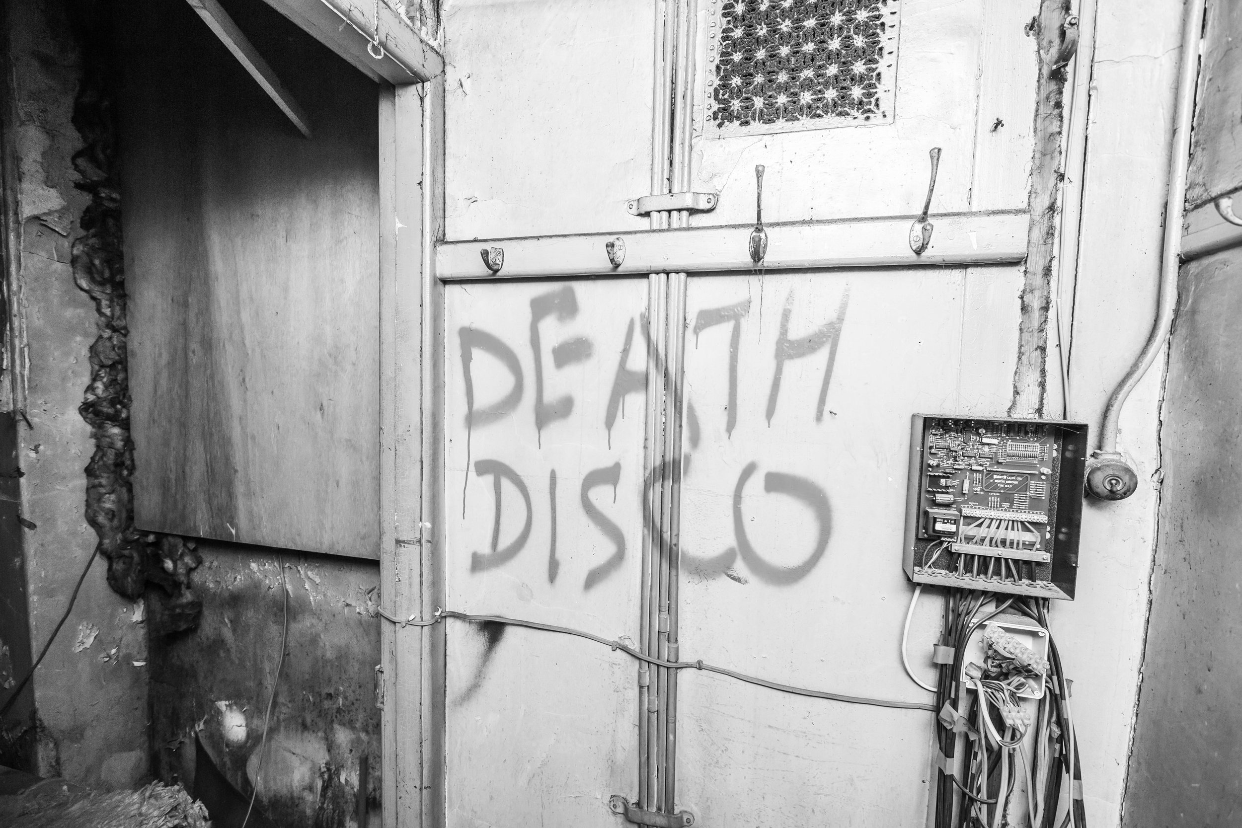
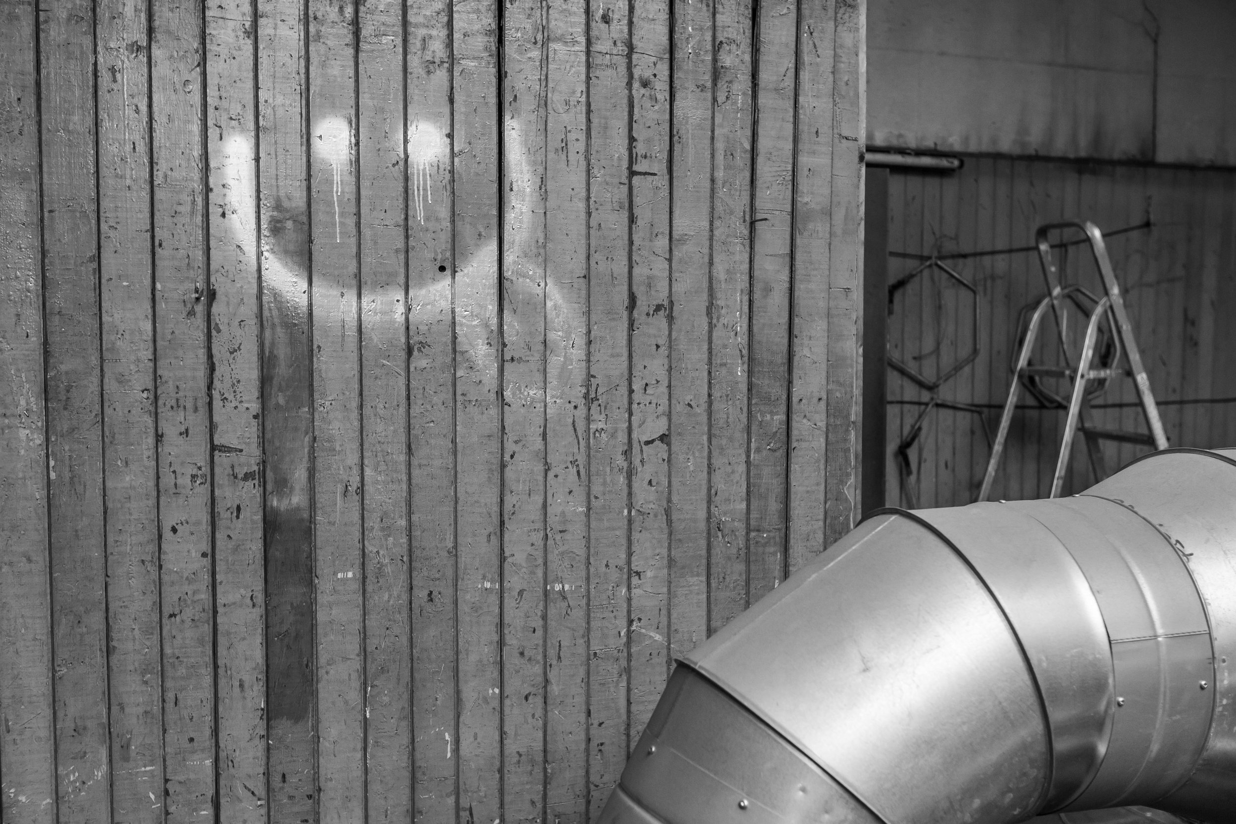
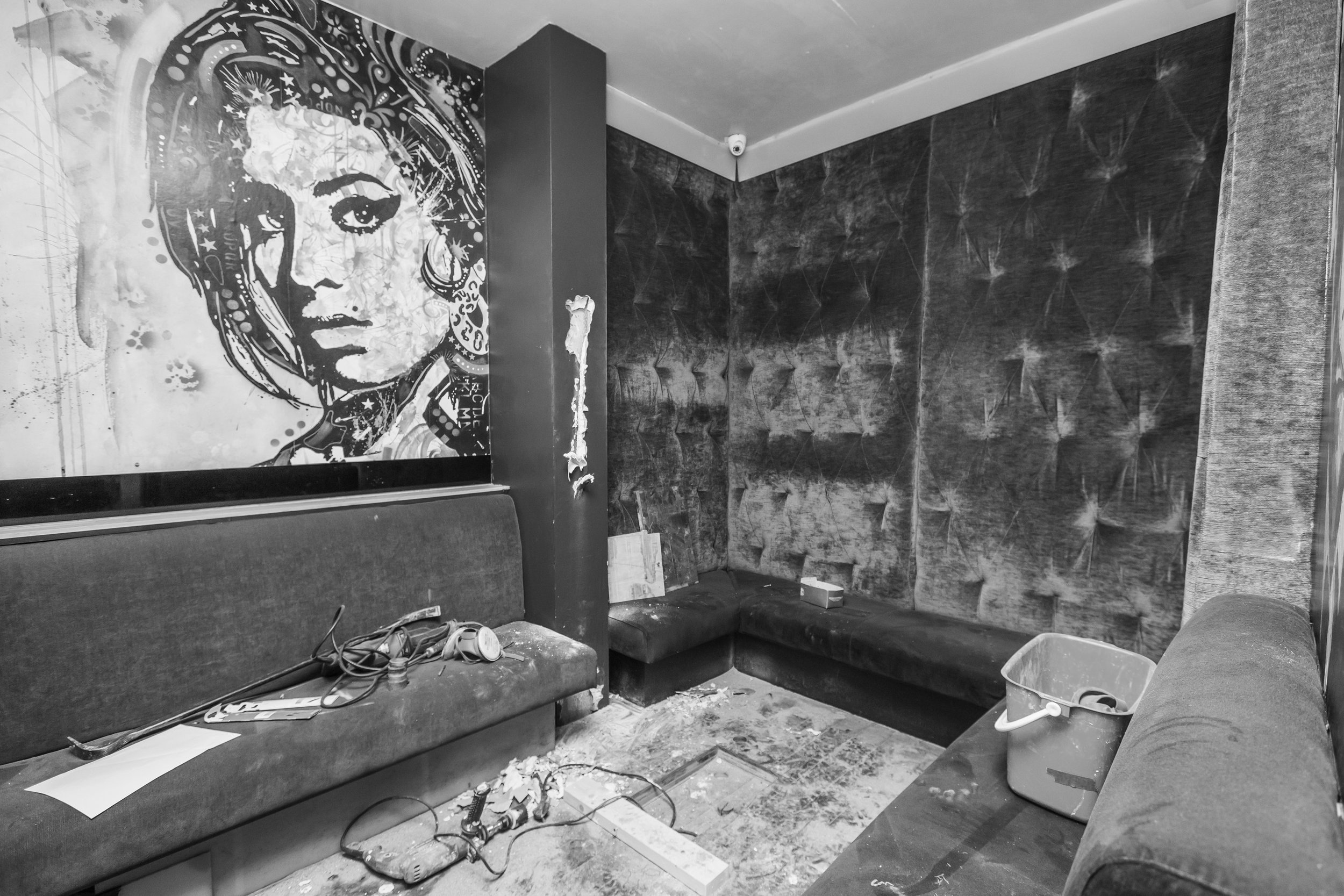
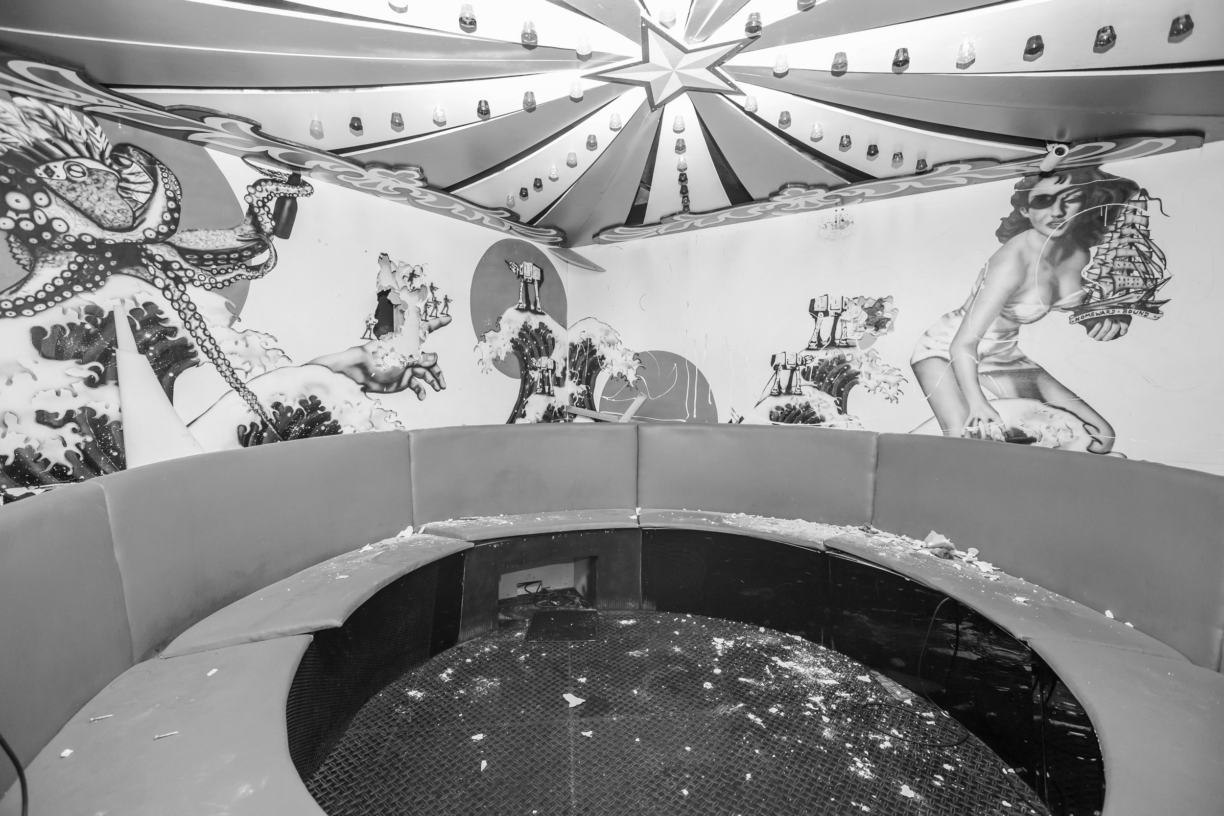
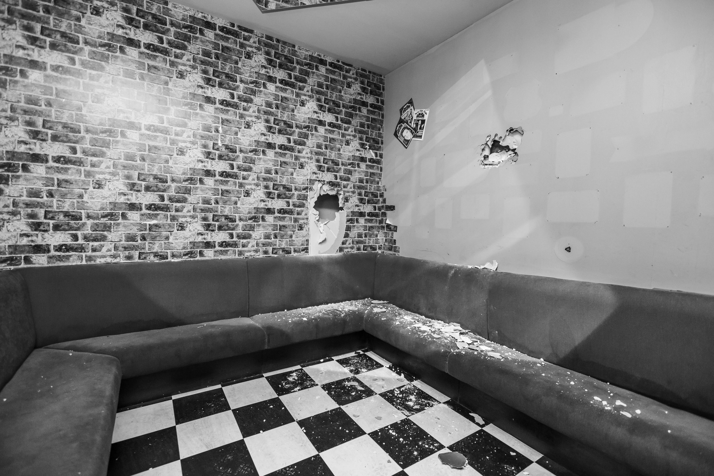
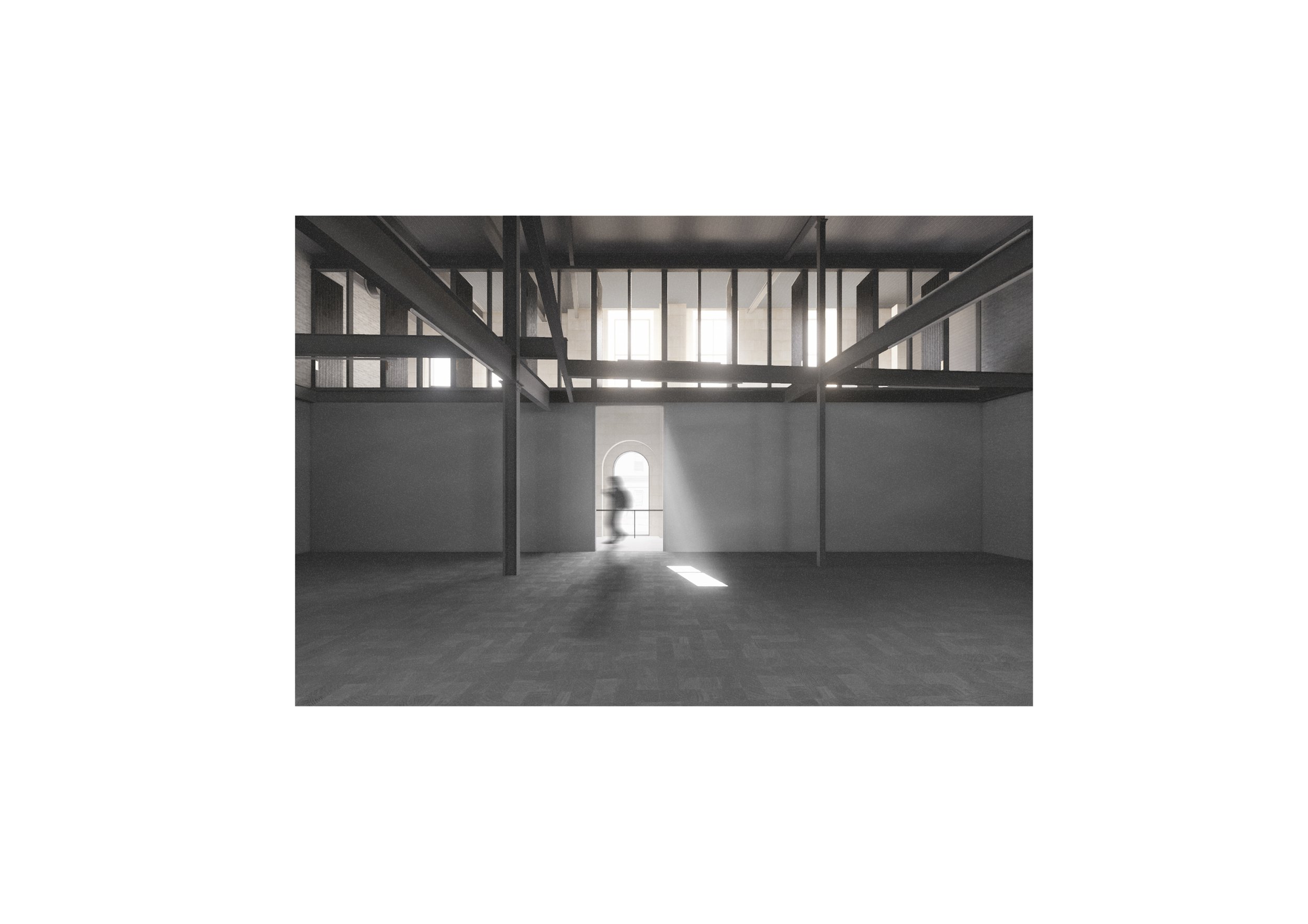
The extension into the neighbouring warehouse building offered an entirely different set of spaces and opportunities. The dignified market building of 1889 had experienced many ‘’difficult’’ lives, most recently as a nightclub. A purging of the interior, in search of the warehouse, was carried out. This excavated space has been left as much as possible as found, a tangle of structure, rough materials, brick, concrete and steel. The actual ‘’rediscovery’’ of this space was logistically very difficult, involving the removal of decades of sordid accumulation, stabilization of the existing structure all of this against onerous site conditions i.e. busy Market Street and electrified railways tracks, a very tight budget and a COVID shutdown.
The resultant elemental warehouse space is materially intense in contrast to the ephemeral nature of the original galleries. The new warehouse spaces are characterised by a lack of discipline. They are dark and uninhibited, unrestrained and materially intense. Unlike the ‘’white cube’’ which invites introspection and reflection the new warehouse space tends to the collective experience. This new space, coupled to an open agenda for performance and cross art form collaboration, enables new and exciting possibilities for artists and audiences.
The combination of two very different worlds, light and dark, creates an ensemble of spaces that express a contemporary architectural spirit of reuse and openness, inclusivity and tolerance.
-
Contract Value
£2.4M
Area
1,447m2
Completion
2021
Client
The Fruitmarket Gallery
Contract
Traditional
-
Architects - Reiach and Hall Architects
QS - Gardiner & Theobald
Principal Designer - McGregor Bowes
Structural Engineer – David Narro Associates
M&E Engineer – Max Fordham
Main Contractor – Clark Contracts
-
Awards
Scottish Design Awards Public Building of the Year 2022
Scottish Design Awards Regeneration Project of the Year 2022 Shortlisted
Scottish Design Awards Retrofit Project of the Year 2022 Shortlisted
-
A Mirroring of Ideas and Intentions
The Fruitmarket Gallery plays a vital role in the shaping and propagation of contemporary arts culture in Scotland. In our straightened times arts organisations like the Fruitmarket, although of national importance, operate on the margins of financial viability. To survive they must be resilient, inventive, and agile, relying heavily on the intelligence, energy and guile of their staff and board. Accessibility and inclusivity are central to the Fruitmarket’s developing remit and ambitions.
These characteristics and intentions are mirrored in the ambitions of the architectural project. Arts buildings must be flexible and open. They must support the organization in its aims. They must be capable of being re-imagined, maintaining their usefulness and relevance.
The Architectural Project
A 1930’s market building, adjacent to Waverley Station in central Edinburgh, was converted to an art gallery by John L Patterson in the 1970’s, then radically restructured by Richard Murphy Architects in the early 1990’s. By 2013 the gallery’s ideas and direction, along with the funding landscape, had changed resulting in plans for a major reconstruction project. The funding for a comprehensive redevelopment however was unsuccessful. Rebounding from this setback the client group reassessed their approach. A further competition was organised in 2018. The essence of the brief was to retain, refurbish and recalibrate the original gallery while extending into the adjacent warehouse.
The underlying theme of our submission was ‘’let’s work with what we have.’’ The existing buildings have been heavily altered, each bear evidence of their earlier uses, let’s celebrate those histories. We directly addressed the pragmatic issues with the existing galleries and in an almost archaeological approach simply unearthed the basic volume of the new warehouse. The completed and connected building complex is a rich palimpsest of the traces of previous lives while anticipating future lives. The two main components of the brief, renovation, and extension are contained within and expressed through two contrasting and complimentary archetypal spaces.
The Original Galleries
The renovation, recalibration and reconfiguration of the existing building ensures that it is fully accessible and fit for the showing of contemporary visual art. We were sensitive to the building’s qualities and its spatial characteristics, traditional ‘’white’’ gallery spaces that are light filled and rationally structured. The top-lit galleries particularly convey a sense of the solitary, a place for the individual to quietly engage with art. We sought to heighten the sense of balance and symmetry through a simplification of some of the existing gallery elements. The work to the existing galleries included the replacement of roof glazing, renewal and alterations to wall finishes, new services installations, new lift and a redesign of the main stair into a safer, quieter, more grounded element. The overall design intention was to amplify the existing sense of light and space in order that the art remains centre stage.
Critical to concerns of financial viability, the reconfiguration also increased the café and shop spaces along with new and expanded kitchen and improved accessible toilet facilities. Critical to the gallery’s outreach and inclusivity ambitions, the project also created a dedicated education suite. Collectively these amendments dramatically improve the gallery’s ability to host performances, conferences and events.
The Warehouse
The extension into the neighbouring warehouse building offered an entirely different set of spaces and opportunities. The dignified market building of 1889 had experienced many ‘’difficult’’ lives, most recently as a nightclub. A purging of the interior, in search of the warehouse, was carried out. This excavated space has been left as much as possible as found, a tangle of structure, rough materials, brick, concrete and steel. The actual ‘’rediscovery’’ of this space was logistically very difficult, involving the removal of decades of sordid accumulation, stabilization of the existing structure all of this against onerous site conditions i.e. busy Market Street and electrified railways tracks, a very tight budget and a COVID shutdown.
The resultant elemental warehouse space is materially intense in contrast to the ephemeral nature of the original galleries. The new warehouse spaces are characterised by a lack of discipline. They are dark and uninhibited, unrestrained and materially intense. Unlike the ‘’white cube’’ which invites introspection and reflection the new warehouse space tends to the collective experience. This new space, coupled to an open agenda for performance and cross art form collaboration, enables new and exciting possibilities for artists and audiences. The combination of two very different worlds, light and dark, creates an ensemble of spaces that express a contemporary architectural spirit of reuse and openness, inclusivity and tolerance.
RIAS Andrew Doolan Best Building in Scotland Shortlist 2024 Videography by @stephensonand_cuts | @clickclickjim
RIAS Andrew Doolan Best Building in Scotland Shortlist 2024
The Fruitmarket Gallery
Videography by @stephensonand_cuts | @clickclickjim
Fruitmarket Video
Sketchbook
Site Photographs
