Project Oriel
Reiach and Hall Architects, in collaboration with Bennetts Associates, was one of the teams shortlisted to design a new joint eye care, research, and educational facility within the historic St Pancras Hospital complex, scheduled to open in 2024. The proposed integrated facility aimed to relocate the City Road services to a new, state-of-the-art, flexible, and modern space, prioritizing patient care while attracting and retaining the best ophthalmic scientists, educators, and clinicians. The scheme was supported by Moorfields Eye Hospital NHS Foundation Trust (Moorfields), University College London (UCL), and Moorfields Eye Charity (MEC).
Reiach and Hall, in collaboration with Bennetts Associates were shortlisted in this major competition which attracted entries from around the globe. The brief combined clinical care with research and education, with a strong emphasis on providing a building which would encourage collaboration.
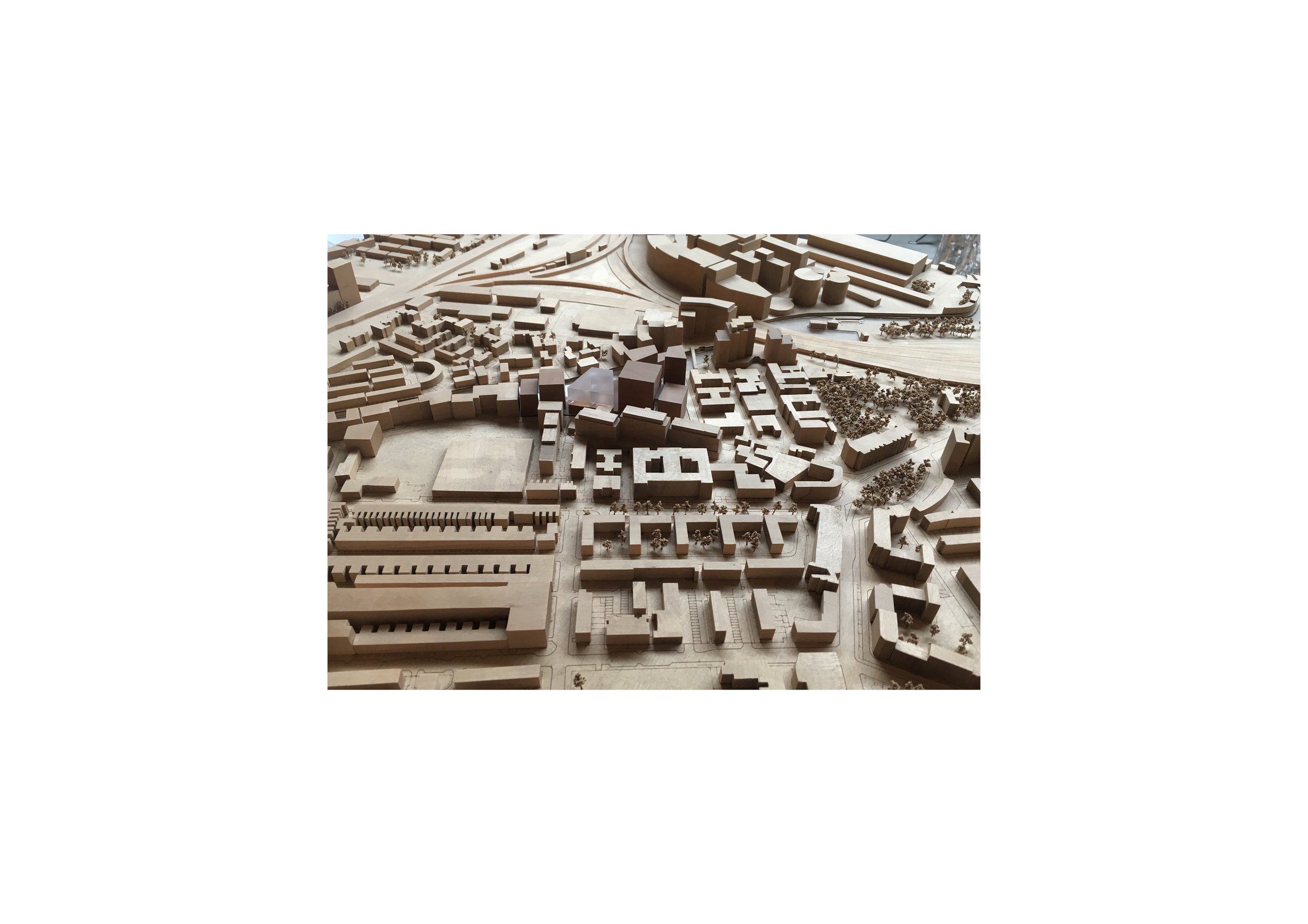
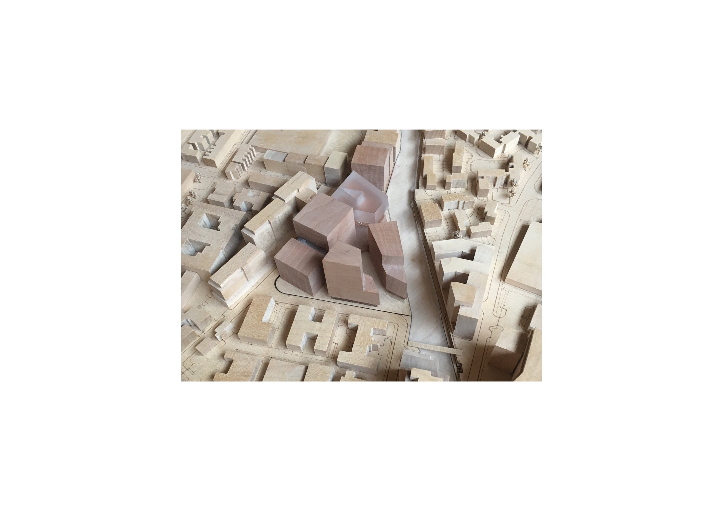
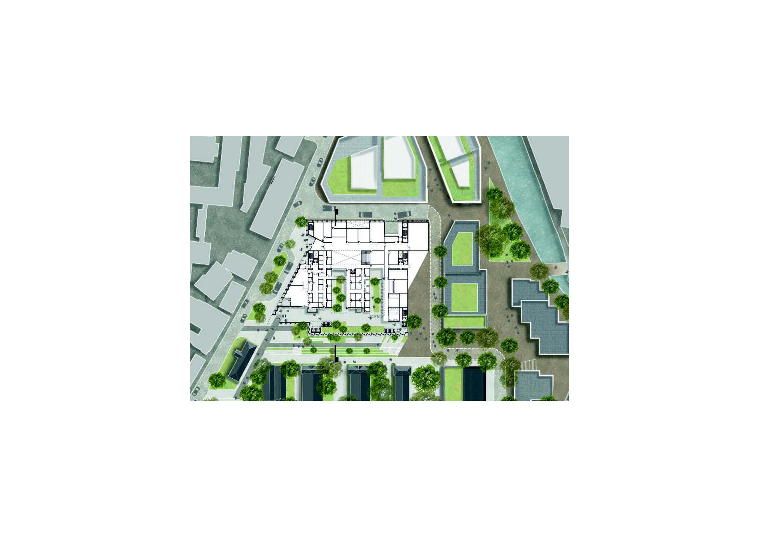
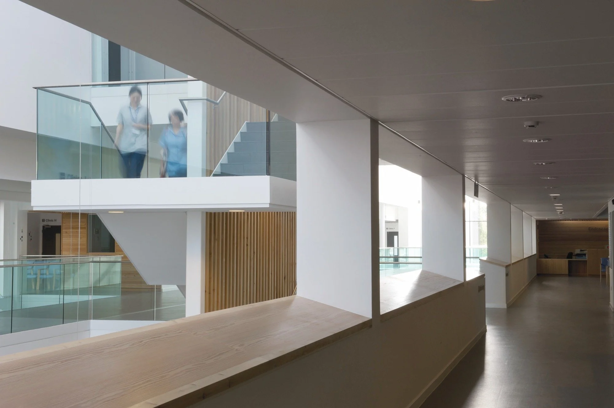
Our vision places Project Oriel in a ‘green’ setting - transforming the user experience from the busy congestion of Old Street into a calm and beautiful landscape, both inside and outside. This vision, combined with our expertise in sustainability, has led us to call our proposals “Oriel Green”.
Oriel Green is rigorously functional, with an ease of access and orientation for a simple and reassuring patient journey, underpinning a high quality overall user experience.
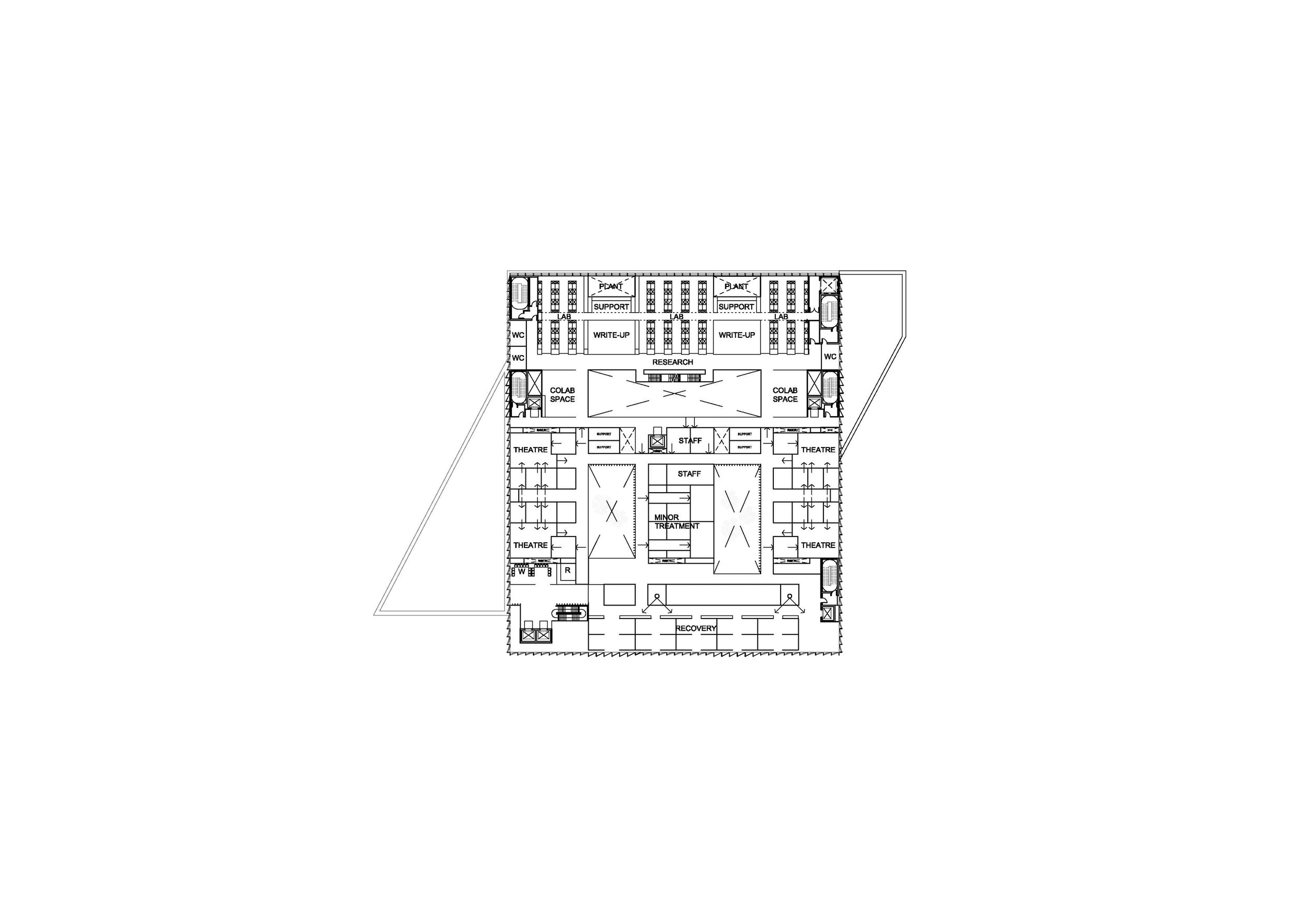
The clinical diagram is rational and efficient but, taking a cue from the commercial sector, the well-engineered ‘shell’ is simple and adaptable whilst the internal layout is mostly loose-fit, enabling future change. We proposed a building which we hope provides the right linkages and opportunities for conversation.
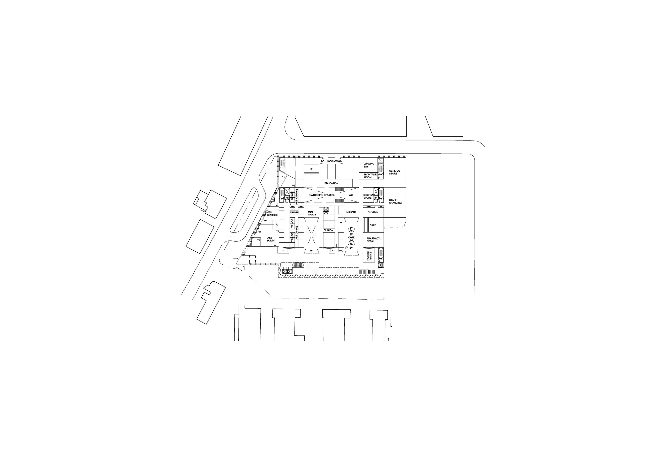
In the centre is the clinical zone, where patients meet clinicians. To the south is the patient arrival and waiting zone. To the north is the collaboration zone, where clinicians meet researchers, while to the north of that is the research zone. Underlying it all is the education zone, linking both to clinical and research zones. The major interfaces provide as much contact as possible, and are designed as delightful places to be, encouraging human interaction and conversation. They take the form of linear atria or arcades, each with its own character, while daylight and air are admitted to the large central clinical area via stepped courts running north to south, linking in a more symbolic manner public to private, patient to research as well as park, through hospital to the street beyond.
The building itself is conceived in a generically flexible manner – while the diagram outlined is driven by particular requirements of the brief, the spaces provided are capable of almost any change of use. We are accustomed to building offices which can be fitted out in any manner. Here we are simply taking that a step further and providing the first fit out scheme. Standard floorplate dimensions and a rational layout of circulation (which ultimately will be based around the structures of healthcare fire regulations) make almost any likely change of use feasible.
-
Contract Value
£225M
Area
11,500m2
Completion
2019
Client
Moorfields Eye Hospital and UCL Institute of Ophthalmology
Contract
Tender
-
Architects - Reiach and Hall Architects
Assistant (Joint Venture) - Bennetts Associates
M&E Engineer - Buro Happold
Healthcare Planner - MJ Medical
-
Reiach and Hall, in collaboration with Bennetts Associates were shortlisted in this major competition which attracted entries from around the globe. The brief combined clinical care with research and education, with a strong emphasis on providing a building which would encourage collaboration.
Our vision places Project Oriel in a ‘green’ setting - transforming the user experience from the busy congestion of Old Street into a calm and beautiful landscape, both inside and outside. This vision, combined with our expertise in sustainability, has led us to call our proposals “Oriel Green”.
Oriel Green is rigorously functional, with an ease of access and orientation for a simple and reassuring patient journey, underpinning a high quality overall user experience.
The clinical diagram is rational and efficient but, taking a cue from the commercial sector, the well-engineered ‘shell’ is simple and adaptable whilst the internal layout is mostly loose-fit, enabling future change. We proposed a building which we hope provides the right linkages and opportunities for conversation. In the centre is the clinical zone, where patients meet clinicians. To the south is the patient arrival and waiting zone. To the north is the collaboration zone, where clinicians meet researchers, while to the north of that is the research zone. Underlying it all is the education zone, linking both to clinical and research zones. The major interfaces provide as much contact as possible, and are designed as delightful places to be, encouraging human interaction and conversation. They take the form of linear atria or arcades, each with its own character, while daylight and air are admitted to the large central clinical area via stepped courts running north to south, linkingin a more symbolic manner public to private, patient to research as well as park, through hospital to the street beyond.
The building itself is conceived in a generically flexible manner – while the diagram outlined is driven by particular requirements of the brief, the spaces provided are capable of almost any change of use. We are accustomed to building offices which can be fitted out in any manner. Here we are simply taking that a step further and providing the first fit out scheme. Standard floorplate dimensions and a rational layout of circulation (which ultimately will be based around the structures of healthcare fire regulations) make almost any likely change of use feasible.
Sketchbook
